|
For a printer friendly version of this lab, click here. Background: In this lab, you will plot a graph showing the relationship between moon phase and global temperature. You will also show the statistical errors for each measurement by the use of error bars. Measurements are never exact and the data in this activity reflect this by giving an error for each measurement. An error bar graphically shows the range over which the actual value is expected to be found, given the measured value. Materials:
Procedure:
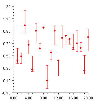
Error Bar Sample:
Error bars are used to indicate an estimated error in a measurement. The most common error bar plot is one in which the errors are in the y-values. The example here shows such an error bar plot. Note that the values of the low and high arguments are absolute y values, not relative or percentage values. It is also possible to have horizontal error bars, indicating errors in x-values; and error bars that indicate errors in both x and y values.
Data:
Graph: For the graph, you are plotting Temperature Anomaly (in degrees Celsius) along the y-axis and Moon Phase along the x-axis (from 0.0 to 1.0 where 0.0 represents the new moon and 1.0 represents the full moon). Below is a sample of the graph layout. Note: the Moon Phase only goes to 0.30 in the graph below - remember your graph must go to 1.0. Be aware that this graph is not completely labeled - you are expected to label the graph completely (i.e. axis labels; graph title).
Analysis & Conclusions: 1. How do error bars help you decide how to place a best-fit line? How do error bars help you determine the accuracy of a best-fit line?
2. Using your best-fit line, extrapolate (estimate) to find the temperature anomaly at the new moon phase and the full moon phase.
3. Are global temperatures warmer at full moon than they are at a new moon? Hypothesize an explanation for your answer.
4. Calculate the difference between the two values you gave in the answer to Question 2. Could you detect this temperature difference using the thermometers you use in school? Explain. Remember to use the proper format when writing up this lab.
< Lab Notes > |
||||||||||||||||||||||||||||||||||||||||||||||||||||||||||||||||||||||||||||||||||||||||||||||||||||||||||||||||||||||||||||||||||||||||||||||||||||||||||||||||||||||||||||||||||||||||||||||||||||||||||||||||||||||||||||||||||||||||||||||||||||||||||||||||||||||||||||||||||||||||||||||||||||||||||||||||||||||||||||||||||||||||||||||||||||||||||||||||||||||||||||||